Showing posts with label projects. Show all posts

Saturday, October 26, 2013

DIY Glittery Spiderweb Halloween Cards with template


Last October, Hurricane/Superstorm Sandy prevented most Halloween celebrations, and although I don't usually get too into the holiday, having a year off may have been just what I needed to get the spirit back.  For my cards this year, I'm going all the way with glitter. 

Using some regular Elmer's Glue and black glitter, these spiderweb cards are a synch to make. You can freehand a spiderweb design, or download and trace the template I've created from my sketch. Obviously you could glitter up anything, for any occasion, but hey, let's focus on the coming holiday.


Step 1: 
Create a spiderweb design freehand, or download and trace the template I've created from my sketch. Remember to keep your pencil marks light.

Step 2: 
Trace over the drawing with white glue.  I used a toothpick to get in small areas or to clean up any slips (there will be some).  Hold the bottle at an angle to prevent it coming out in globs and work in small sections so that glue doesn't dry before you can add the glitter. Superfine glitter will work best on these thin lines.

Step 3:
Sprinkle glitter over top. Let stand about 30 seconds, and then tap off excess.  You can go back in with a toothpick and clean up any smudges.  I like how non-uniform the lines are, it almost give the feel of water droplets on the web.

Optional: To keep glitter in place, cover the card with 1-2 coats of acrylic spray.  I used Krylon Crystal Clear Acrylic.  Make sure to spray in a well ventilated area. Right outside your front door with the door open so all the fumes go back in the house is not considered a well ventilated area (I'm telling myself this).  

Have a spooky Halloween!

Tuesday, September 10, 2013

DIY Quick and Easy washi tape bunting


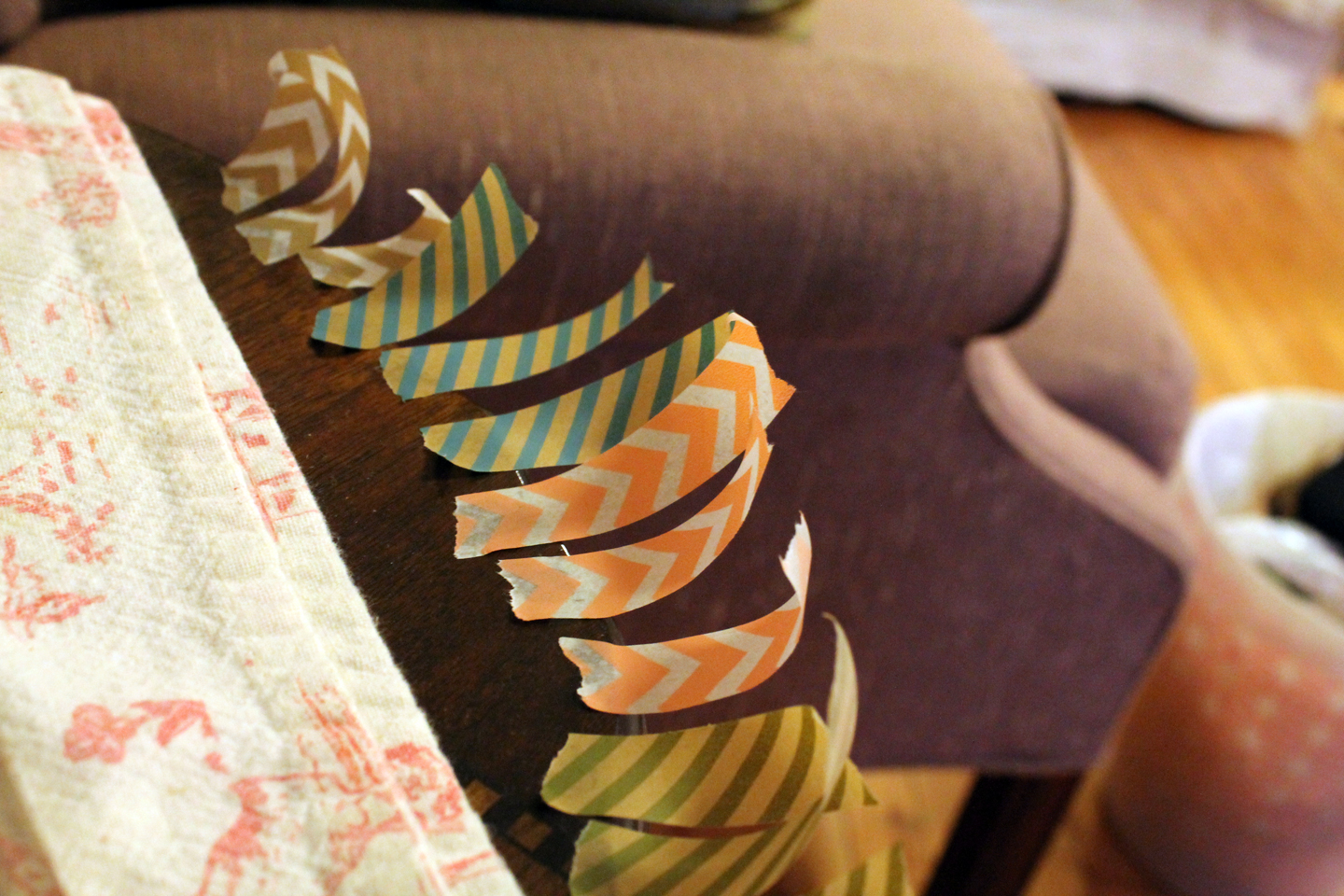
Here's another quickie garland to add to your repertoire, adding to the 20 minute paper button garland I posted a few months back. This project is very simple and doesn't require much instruction at all. Just fold small pieces of washi tape over a thin cotton string and snip the ends. I chose to do little Vs at the end of mine, but semicircles, fringe, patterned craft scissors—really anything will work here. Here are a few tips.

Pick washi tape that coordinates a little better than mine.

More cheery?

Tear off your tape ahead of time and line it up so that you can work quickly.

Mise en place

It will be easier to put the tape on the string if you have it at tension, so tie or tape it between two stable things.

Tighten up!

When you reach your desired length, find a pretty spot to put it, like a mirror or picture frame.  You can even tape each end to a skewer and pop it atop a cake!


Thursday, August 1, 2013

Tree and moon etching #tbt

As the instagramers and tweeters say, it's Throwback Thursday!  Although I'm sure you'd prefer to see a picture of me in the tub as a fat baby, you'll have to settle for this class project from the college years. 2005 to be exact.

I was really into trees, at the time

This was a plexiglass etching, sketched freehand directly onto the plexiglass.  The paper is wet and then run through a printing press with the wall paper (moon) and tissue paper (blue leaves), where the pressure fuses the two papers together.  Oh the glory days of having unlimited access to gigantic studios and commercial grade machinery!

Monday, July 22, 2013

Pug and Bulldog Illustration

Though I've never met Frank and Lola, this pug and English bulldog have a rather charming story. Found together as puppies sharing an abandoned box in downtown Philadelphia, they love and take care of each other like brother and sister.  This pen and ink line drawing of the two pudgy pups will make its final home in a logo (though I'm not quite sure for what).  India ink on watercolor paper.

They love each other.

Lola, the bulldog

Frank, the pug

The collars were added to the original illustration to add some personality and ensure the dogs wouldn't be taken to the pound and euthanized. Here's the original, sans collars.

This is being naked for a dog.

Interested in a custom illustration of your dog? Email info@lightheartpapercompany.com

Friday, July 12, 2013

Colorful Dreamcatcher Art

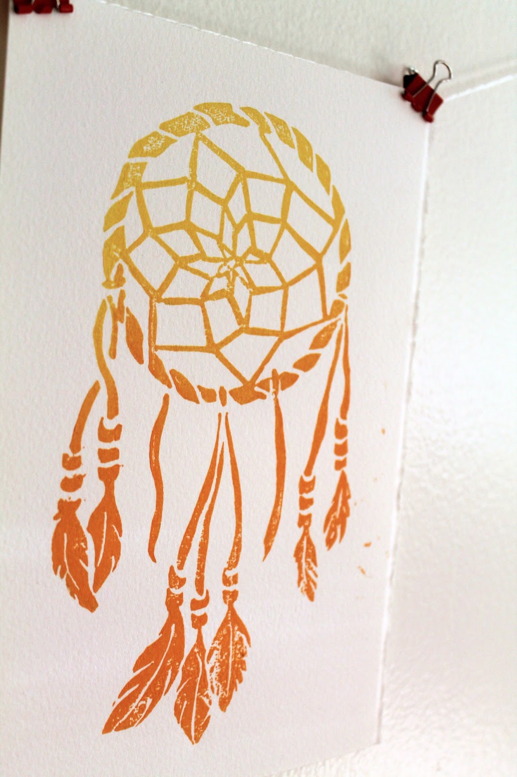
After my recent trip to the Utah and Arizona, I was feeling the inspired by the brilliant colors and native spirit of the southwest. I got a little caught up in the vacation mindset and bought a dreamcatcher from a little mountain shop.  I built one from a kit when I was just a little guy (one of the many craft kits that actually resulted in a finished project), so when I got home, I decided to make an adult version (in a totally SFW way). The result is these linocut prints in yellow/orange and gold.

Very Boho

Gold, or dorado

Both colors are available to purchase in the Etsy shop, Lightheart Paper Company, orange and gold.

Unlike a lot of my other prints, this one I drew entirely by hand, no Adobe Illustrator involved.  Here's the sketch, which started in pencil and ended in sharpie.


Originally I had intended to add some text at the top saying "Sweet Dreams," which you can see ghosts of in the sketch, but in the end it seemed better to leave it off.  I may add it as separate stamp in the future, that way it can be printed with or without the text.

I'm going to hang one or two of these above my bed with the real one in hope that I can stop having the dream where I am in school but don't know where I'm supposed to go!

Tuesday, June 25, 2013

Chalk lettering illustrations on "I Call Shotgun"!

A few weeks ago I was given an incredible opportunity to create some chalk board illustrations for the set of AOL's webcast I Call Shotgun. This video segment features Bravo's Andy Cohen interviewing Jerry Seinfeld as he wraps up the second season of his web show Comedians in Cars getting Coffee. Here's a clip from youtube, you can see a nice closeup of the set illustration at 0:07.


The full show can be seen here.

In lieu of the cars and coffee theme, the set was designed as a retro, right-off-the-highway diner, and some typographic chalkboard menus fit right in.

Retro chic, right down to the cronuts

Time was tight, with one night spent sketching up ideas, and the next night to executing them on a set that was only half built after working an 8 hour day.  But the set designer, who happens to be my very talented brother, must have know that I couldn't say know to hand drawn art, especially when typography and Seinfeld are involved.  The panels totaled 6 in all, and I kept with one food theme for each that could be the point of emphasis.  Here are some pics from the set as well as all 6 after the jump.

Left side panels

Right side panels

Tuesday, May 14, 2013

Ink and watercolor flowers


Last week with Mother's day approaching, I decided to experiment with a new style for card, and it turned out to be one of my favorite pieces that's I've done a while.  It works well as a single flat card that doubles as a frameable illustration, and I'm going to tell you how I did it. A little inspiration from my Pinterest flower board, a print I have at home, and all the ink illustrations I've been doing lately, I set to work sketching out these blossoms.

Free style sketching
I wanted to keep the style feeling loose and organic, so I didn't strive for exact replicas but instead used the images as a guide for the movement of the lines. If you're recreating at home, just a reminder you can do some major damage with an eraser, so you want to sketch as lightly and as little as possible. I'm using some pretty heavy 120lb stock watercolor paper and a 2H pencil which helps a little.

Next I drew over the lines with India ink, adding some variation in thickness. I am in desperate need of a new bottle of ink if anyone is looking for a for-no-reason gift for me. It starts to gunk once it gets to a certain age and I can't seem to find a replacement anywhere. 

Now you can actually see it.

Unlike watercolors, India ink is permanent once it is dried so I was able to do the watercolor last.  You could of course add your color first and ink second if you prefer. It did start to smudge if I pressed too hard with the paintbrush. When I started I wasn't sure if and how much color I would use so that's why I added mine afterwards. To avoid looking hippie psychedelic, I stuck with a 4 color palette of sherbert-y colors. 

Yum
I was so pumped, I even did a second one. 


Definitely going to use this style more in the future.  They didn't even take that long, only a few hours!

Tuesday, May 7, 2013

Wedding at the zoo part 2!

Back in January, I posted this fun save the date for a wedding at the Bronx Zoo.  My post at the time was one of the alts that didn't make the cut, so here's the one that did.

Clockwise from top left: save the date, reception card, invitation, reply card

Monday, April 29, 2013

Busy springtime

With the collision of weddings, birthdays, and deadlines, it's been nonstop action this April.  My  conversations all begin with my asking, "When is it going to get warm?" to which my boyfriend sincerely responds, "I think this week it's supposed to be nice." And after one nice day, it goes back to 50 degrees.  But now that the storm has passed, I'm looking forward to a few creative weeks before a road trip vacation to the wild, wild west (this one, not this one).  The biggest news: the soon-to-launch etsy shop where I'll be selling my prints!  And now that I've written it here, I'm committed to it.  Here's a preview of the newest woodblock.

Here you are, a message of love. 

I'll be sure to make an announcement when it goes live!

Tuesday, March 26, 2013

Modern wedding invitations for Fall

Even though Spring is just beginning and autumn seems miles away, I'm posting this follow up to my previous entry for Autumn save the dates with the actual invitations.


As I mentioned in the first post, one of my favorite things about these is that even though they use a fall color palette, the graphic pattern and bold type are so unexpected. This set also really shines when it comes together as a suite that includes an invite, rsvp, envelope liners, and reception card all held together with a monogrammed band. The band is made of maroon ribbon and adhered to itself and the paper monogram with glue dots, the greatest thing ever.

A monogrammed band: wrap it up

The bride gets a lot of credit for these; she knew just what she wanted.  Elements of the pattern from the save the date are used throughout, and a berry purple was substituted for the golden yellow to better match the flowers.  Here are a few closeups!

The invitation

The reception card

The color palette and pattern could easily be changed to match any season or theme desired by a modern, anti-flower couple!

Monday, February 18, 2013

Celebrating 2 years with a throwback print

Taken by the Hand turned 2 yesterday and to celebrate I ran a few woodblock prints of an old favorite. This was the first block print I'd done since a long post-college hiatus from printing after being inspired by an old piece of poplar I'd found in my parent's basement. The design was one I'd done in Illustrator, something that started out as a doodle but just kept going. It was the melding of digital and hand-made that I'd been seeking.  But alas, my first few print runs were lacking pizazz, a problem quickly solved by jumping on the ombre trend. The original print blends pink and blue ink for a vibrant gradient. This guy holds a special place in my heart, and a specialer place on my wall and the walls of a few friends.

The words came first and inspired the twisting and curling lines,
alluding to graphic vines and roots

So for the refresh I added a third color and instead used yellow, pink and orange.

A little like a sunset

Oddly, these colors remind me of 90s era Oakley sunglasses, and you can judge for yourself whether that's a good or bad thing.  Number two color combo was turquoise-to-blue printed on a sheet of wood paper that'd been sitting in my stash for way too long.  I'd have loved to do the brighter colors on this but didn't think it would show up on the light wood.

Woodblock printed on wood: a world turned upside down

Here's a few more shots.

Group shot!


The block and tools. Pink!

I'm planning on doing a few more color combos when I get some more paper, and putting them up on Etsy along with the new woodblock that I'm working on.  Lots of projects have been done over the last two years and this one got me out of a slump and kickstarted them all!


Wednesday, February 6, 2013

Manayunk Bridge Illustration

Bridges are cool, huh? I recently did this illustration for a save the date of the Manayunk Bridge in Philadelphia.  It was a challenge to figure out what to do with the water, but I thought a reflection was necessary so it didn't look like a floating bridge. Don't they have those in Mario Bros?

A modern marval 


I'm working on a few more in the same style right now so they'll be up later this month.  As always this is india ink on watercolor paper.  I'm really liking this style and getting in the groove with it for sure!

Saturday, January 19, 2013

A wedding at the zoo!

You can imagine how excited I was to be working with Rachel and Clay when they told me their wedding next year would be held at the Bronx Zoo!  What a unique and nontraditional venue that allowed for some really creative stuff.  After speaking with the bride, we'd have to find the right balance between zoo theme and classy wedding, so it doesn't look like a child's birthday party.  To keep it elegant, I went with simple animal silhouettes in black on bright white linen paper.  As a personal touch, one of the silhouettes is actually the couples' rambunctious mutt, Hannah!

I took several stabs at this, and here's one of the alternates, more modern and casual with different kinds of type mingling.
All the animals at the zoo get along swimmingly


The final invitations just printed and I'll post them shortly, along with the official save the date.

Sunday, December 23, 2012

Making this year's holiday cards

Truth be told, I was pretty unmotivated to make Christmas cards this year, or even writing out store bought ones.  But after a lazy afternoon of watching Home Alone, inspiration struck.  I freehand carved this design into a speedball speedy-cut rubber block, and went for some glitz by using metallic inks.


Here they are drying on my clothing rack (a very good place to dry cards)


I even did a little experimenting with red paper and leftover white ink, which I'm totally diggin'.


The festivities start tomorrow night for my family, and the weather is predicting a possible white Christmas.  Well, 1-3 inches which will melt immediately but I'll take it!

Monday, November 26, 2012

An illustrated carousel

Here's an illustration that I recently did as a commission for Paper Rock Scissors. It is actually a very specific carousel which is on display at the Please Touch Museum in Philadelphia.  As such I felt it was necessary to include some of these unique elements, like the rabbit and goat in the second tier.  As you can see it is very detailed (maybe you noticed the dozens of lightbulbs), and was painted with india ink on watercolor paper.

Click to enlarge for a closer look.

Sunday, November 18, 2012

Rustic Fall Invitations

A few months back, I did this watercolor email save the date for Joel and Jazmine, my most country friends.  This organic handmade style carried through to their invitations, but with colors shifting from spring to fall.  Their wedding came just on the cusp of superstorm Sandy, and was the last beautiful weekend in the area, with leaves bursting with every color.  Their invitation fit right in!


Sunday, November 11, 2012

Art for Hurricane Relief

As many people know, the East Coast was hard hit by Hurricane Sandy two weeks ago.  Here in Jersey City, we lost power for days, some for weeks, and had severe flooding, down trees, live wires, and other scary things.  It was the worst storm the area has seen in centuries and has certainly made me more empathetic to disaster victims.  Personally, I didn't get it nearly as bad as some others, which I'm grateful for, but there are lots of people whose lost homes, cars, and even loved ones.  Houses floated away—that's insane!

To raise money for hurricane relief, I'm selling these prints out of my studio shop.


All proceeds will go to the Red Cross of Northern New Jersey.  The 8" x 10" piece was created from linoleum block and hand printed, so each is unique.  For only $20, it's a great way to show your support, make a donation, and get a little something to take away. 

You can order with PayPal using the email address stillstrongnj@gmail.com.  Or visit Studio Heart to Hand for one click ordering.  

Thanks for all your support as we continue to rebuild!!

Here's a few more pics of the details.


Wednesday, October 3, 2012

DIY driftwood jewelry holder

Several months ago, I went trolling around the New Jersey side of the Hudson River bay on the hunt for driftwood.  Among the discarded styrofoam cups and syringes was a gem of a piece.  At about 2.5" x 1" and about 2 feet long, it had just the right amount of wear that I knew I'd one day find a purpose for it.  That day turned out to be last Saturday, when I finally used it to create this jewelry holder.


Making it was a piece of cake! Read on to learn how.

Tuesday, September 4, 2012

A Graphic Pattern for Autumn Save the Dates

When the bride told me that she wanted something bold and that she "hated flowers" it was certainly a breath of fresh air.  While there's nothing wrong with script font and a floral design, being able to do something different once in a while keeps designs from getting stale.  She knew what she liked: a pattern, Fall colors that don't scream "Fall", and the letter P as a monograph (both their last names being with it).  My job was make these things work together to create something cool.  The result uses mature Autumn colors to create something that's a little modern and a tiny bit rustic, with one big graphic statement.

I'm really into double sided printing right now.

A close up of the big P and banner.

Invitation suite is currently in progress!

Monday, August 27, 2012

A classic invitation set

This traditional and elegant wedding invitation suite was created for Lydia and Rodrigo, a sweet and social couple living in Washington DC. 


For who don't know, DC is prep-city, but a pretty awesome place to hang out nonetheless.  Lydia and Rodrigo both grew up in the area and with their wedding at a country club just outside the city, this style fit perfectly with the scene.