Showing posts with label creative process. Show all posts

Saturday, October 26, 2013

DIY Glittery Spiderweb Halloween Cards with template


Last October, Hurricane/Superstorm Sandy prevented most Halloween celebrations, and although I don't usually get too into the holiday, having a year off may have been just what I needed to get the spirit back.  For my cards this year, I'm going all the way with glitter. 

Using some regular Elmer's Glue and black glitter, these spiderweb cards are a synch to make. You can freehand a spiderweb design, or download and trace the template I've created from my sketch. Obviously you could glitter up anything, for any occasion, but hey, let's focus on the coming holiday.


Step 1: 
Create a spiderweb design freehand, or download and trace the template I've created from my sketch. Remember to keep your pencil marks light.

Step 2: 
Trace over the drawing with white glue.  I used a toothpick to get in small areas or to clean up any slips (there will be some).  Hold the bottle at an angle to prevent it coming out in globs and work in small sections so that glue doesn't dry before you can add the glitter. Superfine glitter will work best on these thin lines.

Step 3:
Sprinkle glitter over top. Let stand about 30 seconds, and then tap off excess.  You can go back in with a toothpick and clean up any smudges.  I like how non-uniform the lines are, it almost give the feel of water droplets on the web.

Optional: To keep glitter in place, cover the card with 1-2 coats of acrylic spray.  I used Krylon Crystal Clear Acrylic.  Make sure to spray in a well ventilated area. Right outside your front door with the door open so all the fumes go back in the house is not considered a well ventilated area (I'm telling myself this).  

Have a spooky Halloween!

Tuesday, September 10, 2013

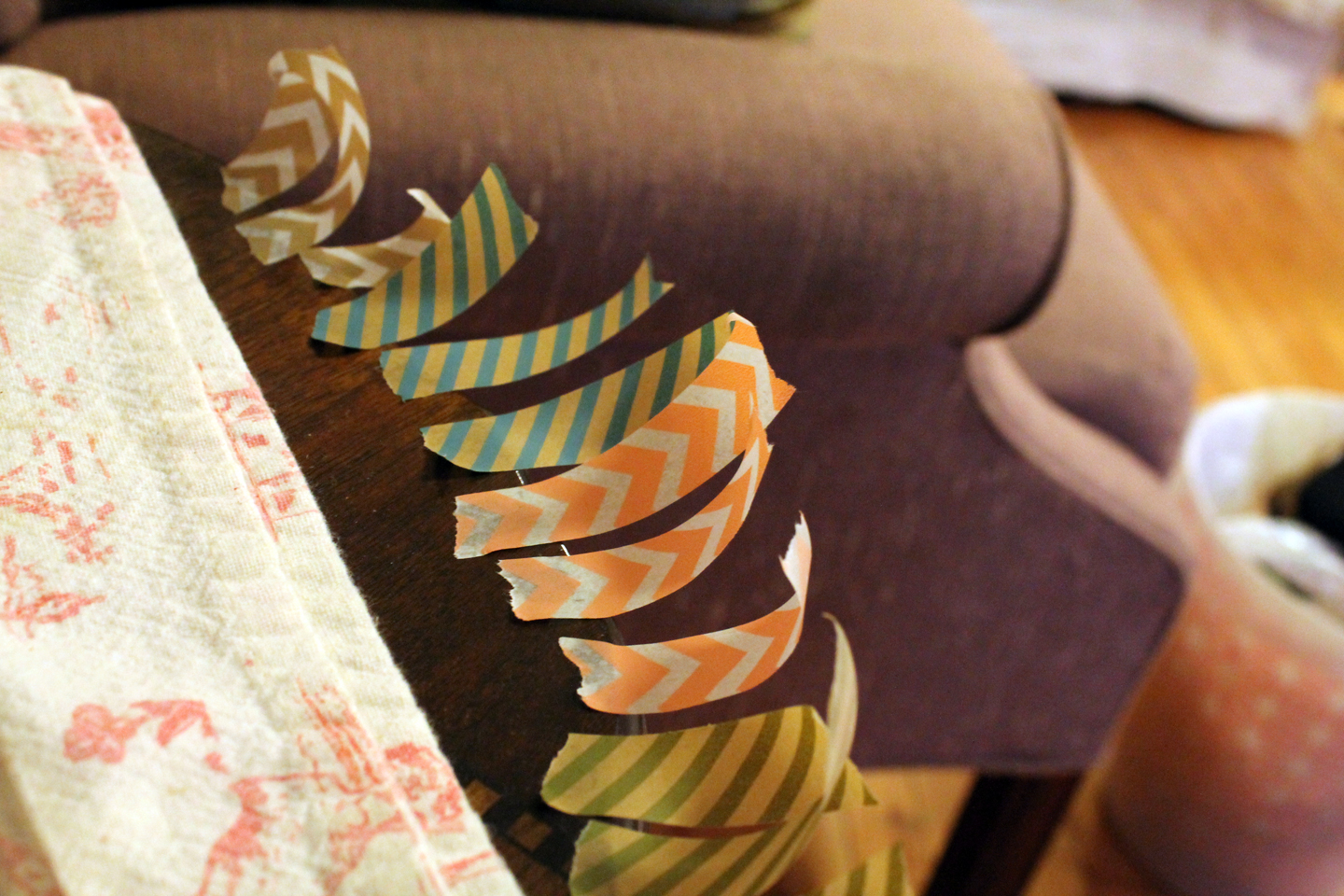
DIY Quick and Easy washi tape bunting


Here's another quickie garland to add to your repertoire, adding to the 20 minute paper button garland I posted a few months back. This project is very simple and doesn't require much instruction at all. Just fold small pieces of washi tape over a thin cotton string and snip the ends. I chose to do little Vs at the end of mine, but semicircles, fringe, patterned craft scissors—really anything will work here. Here are a few tips.

Pick washi tape that coordinates a little better than mine.

More cheery?

Tear off your tape ahead of time and line it up so that you can work quickly.

Mise en place

It will be easier to put the tape on the string if you have it at tension, so tie or tape it between two stable things.

Tighten up!

When you reach your desired length, find a pretty spot to put it, like a mirror or picture frame.  You can even tape each end to a skewer and pop it atop a cake!


Monday, July 22, 2013

Pug and Bulldog Illustration

Though I've never met Frank and Lola, this pug and English bulldog have a rather charming story. Found together as puppies sharing an abandoned box in downtown Philadelphia, they love and take care of each other like brother and sister.  This pen and ink line drawing of the two pudgy pups will make its final home in a logo (though I'm not quite sure for what).  India ink on watercolor paper.

They love each other.

Lola, the bulldog

Frank, the pug

The collars were added to the original illustration to add some personality and ensure the dogs wouldn't be taken to the pound and euthanized. Here's the original, sans collars.

This is being naked for a dog.

Interested in a custom illustration of your dog? Email info@lightheartpapercompany.com

Friday, July 12, 2013

Colorful Dreamcatcher Art

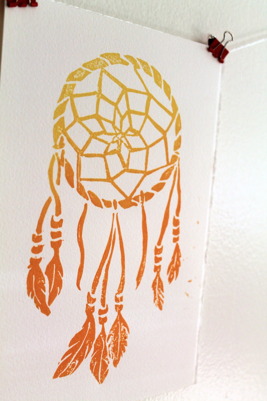
After my recent trip to the Utah and Arizona, I was feeling the inspired by the brilliant colors and native spirit of the southwest. I got a little caught up in the vacation mindset and bought a dreamcatcher from a little mountain shop.  I built one from a kit when I was just a little guy (one of the many craft kits that actually resulted in a finished project), so when I got home, I decided to make an adult version (in a totally SFW way). The result is these linocut prints in yellow/orange and gold.

Very Boho

Gold, or dorado

Both colors are available to purchase in the Etsy shop, Lightheart Paper Company, orange and gold.

Unlike a lot of my other prints, this one I drew entirely by hand, no Adobe Illustrator involved.  Here's the sketch, which started in pencil and ended in sharpie.


Originally I had intended to add some text at the top saying "Sweet Dreams," which you can see ghosts of in the sketch, but in the end it seemed better to leave it off.  I may add it as separate stamp in the future, that way it can be printed with or without the text.

I'm going to hang one or two of these above my bed with the real one in hope that I can stop having the dream where I am in school but don't know where I'm supposed to go!

Tuesday, June 25, 2013

Chalk lettering illustrations on "I Call Shotgun"!

A few weeks ago I was given an incredible opportunity to create some chalk board illustrations for the set of AOL's webcast I Call Shotgun. This video segment features Bravo's Andy Cohen interviewing Jerry Seinfeld as he wraps up the second season of his web show Comedians in Cars getting Coffee. Here's a clip from youtube, you can see a nice closeup of the set illustration at 0:07.


The full show can be seen here.

In lieu of the cars and coffee theme, the set was designed as a retro, right-off-the-highway diner, and some typographic chalkboard menus fit right in.

Retro chic, right down to the cronuts

Time was tight, with one night spent sketching up ideas, and the next night to executing them on a set that was only half built after working an 8 hour day.  But the set designer, who happens to be my very talented brother, must have know that I couldn't say know to hand drawn art, especially when typography and Seinfeld are involved.  The panels totaled 6 in all, and I kept with one food theme for each that could be the point of emphasis.  Here are some pics from the set as well as all 6 after the jump.

Left side panels

Right side panels

Monday, June 10, 2013

Map Illustration: Reading Terminal Market

Maps are awesome and I love them. Now you know. So when commissioned to do a map illustration for Philadelphia's Reading Terminal Market, where you can apparently have weddings, I was suffice to say, pumped. If you've never been there, it's a seemingly endless hall of food vendors selling delicious and mostly decadent foods. To be honest I'm not sure how it works when you hold a wedding reception there, but I was tasked with helping the out-of-towners and towners alike navigate the events of the celebration in a fun and easy way. 

Not to scale.
Each vendor is marked by a little illustration showing the kind of food they have, and there are illustrations for the dance floor, seating, desserts, and of course the bathrooms.  The map was included in the invitation, which would get anyone excited for a belt-loosening cocktail hour.  Here are some close ups.  

Sushi and a Thanksgiving turkey: world's collide
You'll know where to bring your song requests before you even get there.

Here's an overhead of the whole thing:

To Market!

I'd like to continue some map explorations, especially one of my trip out west, and incorporate some of those deep reds and blues.  I smell a summer project...

Want to chat about a customized map? Email me at info@studiohearttohand.com.

Thursday, June 6, 2013

Oh baby (announcements)!

Last week I returned from a two week trip to the Southwest, full of camping, hiking, having fires, and being unapologetically dirty. But more on that in the next post. While I was away, summer officially started, and it's the first summer in years that I have no weddings to go to. 

With lots of friends moving on from marriage to babies, so have I moved on from wedding invitations to baby announcements.  And the smiling face of this little babe will truly melt your icy heart. 

Look, a baby.
Though her parents didn't have professional photos taken, they still wanted to include a picture of their pumpkin for those family and friends who are long distance. In that case, it was best to make the photo part of the announcement, as opposed to having it take up the whole page. The photo is attached with a pastel green paperclip and can thus be easily removed for those who might want to hang onto it. The simple flowers, ladybugs, and butterflies are a cute alternative to storks and diapers and perfect for a baby girl.  The type is a mix of a fat bold font and a soft handwriting, and all is wrapped up in, what else, but a pink envelope. 

The illustrations feel a little Dutch, the colors, not so Dutch.
 
Hey girl, hey.

Looking forward to meeting this bugger in person and calling her all sorts of silly pet names to her face. 

Tuesday, May 14, 2013

Ink and watercolor flowers


Last week with Mother's day approaching, I decided to experiment with a new style for card, and it turned out to be one of my favorite pieces that's I've done a while.  It works well as a single flat card that doubles as a frameable illustration, and I'm going to tell you how I did it. A little inspiration from my Pinterest flower board, a print I have at home, and all the ink illustrations I've been doing lately, I set to work sketching out these blossoms.

Free style sketching
I wanted to keep the style feeling loose and organic, so I didn't strive for exact replicas but instead used the images as a guide for the movement of the lines. If you're recreating at home, just a reminder you can do some major damage with an eraser, so you want to sketch as lightly and as little as possible. I'm using some pretty heavy 120lb stock watercolor paper and a 2H pencil which helps a little.

Next I drew over the lines with India ink, adding some variation in thickness. I am in desperate need of a new bottle of ink if anyone is looking for a for-no-reason gift for me. It starts to gunk once it gets to a certain age and I can't seem to find a replacement anywhere. 

Now you can actually see it.

Unlike watercolors, India ink is permanent once it is dried so I was able to do the watercolor last.  You could of course add your color first and ink second if you prefer. It did start to smudge if I pressed too hard with the paintbrush. When I started I wasn't sure if and how much color I would use so that's why I added mine afterwards. To avoid looking hippie psychedelic, I stuck with a 4 color palette of sherbert-y colors. 

Yum
I was so pumped, I even did a second one. 


Definitely going to use this style more in the future.  They didn't even take that long, only a few hours!

Tuesday, May 7, 2013

Wedding at the zoo part 2!

Back in January, I posted this fun save the date for a wedding at the Bronx Zoo.  My post at the time was one of the alts that didn't make the cut, so here's the one that did.

Clockwise from top left: save the date, reception card, invitation, reply card

Wednesday, May 1, 2013

Watercolor wishes

This watercolor illustration has been a long time in the making. I hesitated on it for a while because I couldn't find the right words and wanted to use my own instead of a quote. It was, however, inspired by a meditation/prayer which I learned on my spiritual journey, but was unable to trace the origin of, "May you be happy, may you be healthy, may you live with ease."  You're supposed to say it to yourself when someone has pissed you off or has caused some deep therapy-necessitating emotional damage.  This one is more suited for a new home or marriage.

It's like, my version of an Irish wedding blessing

While technically I "hand drew" the letters, I did pretty much copy actual fonts while adding embellishments.

Cheater, cheater, pumpkin eater. Wait those aren't the words.

The colors aren't playing nice together and I don't like what's going on with the wind illustrations here. So those are changes that I'll be addressing in the next round.

You can even still see pencil marks--someone's lazy!

I do like the sunshine!

So there's the beta version, a happy wish for friends and enemies alike.

Monday, April 15, 2013

Arts and Crafts at the Herb Farm

Well Sweep Herb Farm in Port Murray, NJ

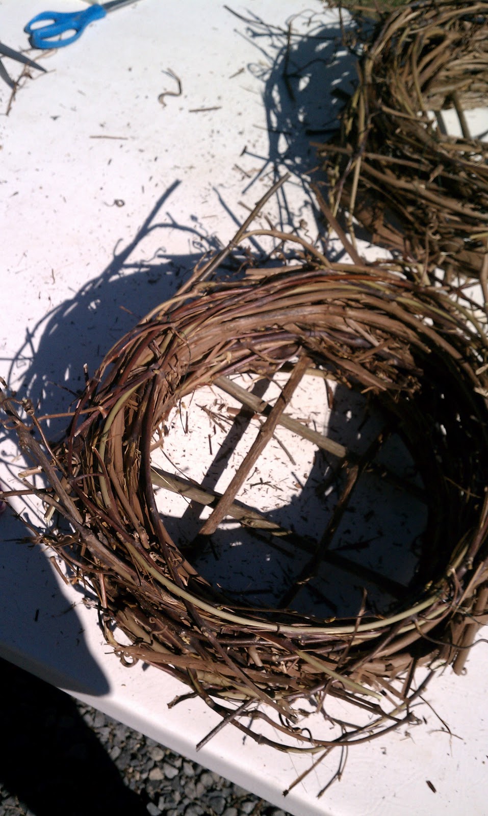
Last Saturday I spent a lovely morning at Well-Sweep Herb Farm where I took a DIY herb planter class with some friends.  I went in there thinking that we'd build a tray and put some basil in it, no biggie, but I was in for a surprise.  For starters, we built the planter by essentially coiling up a nest out of dried grape vine, which is requires the tremendous arm strength and at least two people.

Our tablemates,
whom we hit with the vines a lot

My planter-to-be
We then stuffed it with netting and dirt and planted our choice of 5 herbs.  Mine has rosemary, dill, cilantro and two kinds of parsley. I can't recall the exact names, but it wasn't the normal store-bought variety.

New friends

Here's my finished product:
I intend to not let die

Afterwards we ventured around the farm and greenhouses.  Being on herb farm is a lot like being on a regular farm, except everything is in miniature.  There was even a miniature cat, also known as a kitten.

A crazy variety
Here's a few tall outliers
If fairies exist, they surely live here
More delicious smells and humidity in the greenhouse

If you're local and can make it to Well-Sweep, they offer lots of weekend workshops and are some friendly folk.  Or check out your own local garden centers or farms, they're fun even if, like me, your garden is limited to that planter you just made!  

Tuesday, March 26, 2013

Modern wedding invitations for Fall

Even though Spring is just beginning and autumn seems miles away, I'm posting this follow up to my previous entry for Autumn save the dates with the actual invitations.


As I mentioned in the first post, one of my favorite things about these is that even though they use a fall color palette, the graphic pattern and bold type are so unexpected. This set also really shines when it comes together as a suite that includes an invite, rsvp, envelope liners, and reception card all held together with a monogrammed band. The band is made of maroon ribbon and adhered to itself and the paper monogram with glue dots, the greatest thing ever.

A monogrammed band: wrap it up

The bride gets a lot of credit for these; she knew just what she wanted.  Elements of the pattern from the save the date are used throughout, and a berry purple was substituted for the golden yellow to better match the flowers.  Here are a few closeups!

The invitation

The reception card

The color palette and pattern could easily be changed to match any season or theme desired by a modern, anti-flower couple!

Monday, March 11, 2013

Quick Personalized Stationary

As you can probably tell from my frequent post about cards, I love sending mail. When a boxed card just won't do, and you are short on envelopes, it's easy to whip up a quick, personalized bit of stationary using stamps, cover stock, and some fun paper. 

Leave a pretty note on the car you hit and the owner can't be mad.

To create a unique envelope, simply deconstruct another envelope (make use of that junk mail), trace the shape onto scrapbook paper or some other lightweight paper, cut and reassemble.  Cut your cover stock to fit inside and adorn with your personal monogram or anything else you can come up with.  Don't limit yourself to stamps either!  Now you can write your correspondences like they are always doing on Downton Abbey when they aren't killing off main characters.

A heartfelt apology.

Now you have a very personal note ready in 10 minutes or less!  I'm sensing a "quick and easy" theme starting to emerge for March.