Showing posts with label sketching. Show all posts

Thursday, August 1, 2013

Tree and moon etching #tbt

As the instagramers and tweeters say, it's Throwback Thursday!  Although I'm sure you'd prefer to see a picture of me in the tub as a fat baby, you'll have to settle for this class project from the college years. 2005 to be exact.

I was really into trees, at the time

This was a plexiglass etching, sketched freehand directly onto the plexiglass.  The paper is wet and then run through a printing press with the wall paper (moon) and tissue paper (blue leaves), where the pressure fuses the two papers together.  Oh the glory days of having unlimited access to gigantic studios and commercial grade machinery!

Tuesday, June 25, 2013

Chalk lettering illustrations on "I Call Shotgun"!

A few weeks ago I was given an incredible opportunity to create some chalk board illustrations for the set of AOL's webcast I Call Shotgun. This video segment features Bravo's Andy Cohen interviewing Jerry Seinfeld as he wraps up the second season of his web show Comedians in Cars getting Coffee. Here's a clip from youtube, you can see a nice closeup of the set illustration at 0:07.


The full show can be seen here.

In lieu of the cars and coffee theme, the set was designed as a retro, right-off-the-highway diner, and some typographic chalkboard menus fit right in.

Retro chic, right down to the cronuts

Time was tight, with one night spent sketching up ideas, and the next night to executing them on a set that was only half built after working an 8 hour day.  But the set designer, who happens to be my very talented brother, must have know that I couldn't say know to hand drawn art, especially when typography and Seinfeld are involved.  The panels totaled 6 in all, and I kept with one food theme for each that could be the point of emphasis.  Here are some pics from the set as well as all 6 after the jump.

Left side panels

Right side panels

Monday, June 10, 2013

Map Illustration: Reading Terminal Market

Maps are awesome and I love them. Now you know. So when commissioned to do a map illustration for Philadelphia's Reading Terminal Market, where you can apparently have weddings, I was suffice to say, pumped. If you've never been there, it's a seemingly endless hall of food vendors selling delicious and mostly decadent foods. To be honest I'm not sure how it works when you hold a wedding reception there, but I was tasked with helping the out-of-towners and towners alike navigate the events of the celebration in a fun and easy way. 

Not to scale.
Each vendor is marked by a little illustration showing the kind of food they have, and there are illustrations for the dance floor, seating, desserts, and of course the bathrooms.  The map was included in the invitation, which would get anyone excited for a belt-loosening cocktail hour.  Here are some close ups.  

Sushi and a Thanksgiving turkey: world's collide
You'll know where to bring your song requests before you even get there.

Here's an overhead of the whole thing:

To Market!

I'd like to continue some map explorations, especially one of my trip out west, and incorporate some of those deep reds and blues.  I smell a summer project...

Want to chat about a customized map? Email me at info@studiohearttohand.com.

Tuesday, May 14, 2013

Ink and watercolor flowers


Last week with Mother's day approaching, I decided to experiment with a new style for card, and it turned out to be one of my favorite pieces that's I've done a while.  It works well as a single flat card that doubles as a frameable illustration, and I'm going to tell you how I did it. A little inspiration from my Pinterest flower board, a print I have at home, and all the ink illustrations I've been doing lately, I set to work sketching out these blossoms.

Free style sketching
I wanted to keep the style feeling loose and organic, so I didn't strive for exact replicas but instead used the images as a guide for the movement of the lines. If you're recreating at home, just a reminder you can do some major damage with an eraser, so you want to sketch as lightly and as little as possible. I'm using some pretty heavy 120lb stock watercolor paper and a 2H pencil which helps a little.

Next I drew over the lines with India ink, adding some variation in thickness. I am in desperate need of a new bottle of ink if anyone is looking for a for-no-reason gift for me. It starts to gunk once it gets to a certain age and I can't seem to find a replacement anywhere. 

Now you can actually see it.

Unlike watercolors, India ink is permanent once it is dried so I was able to do the watercolor last.  You could of course add your color first and ink second if you prefer. It did start to smudge if I pressed too hard with the paintbrush. When I started I wasn't sure if and how much color I would use so that's why I added mine afterwards. To avoid looking hippie psychedelic, I stuck with a 4 color palette of sherbert-y colors. 

Yum
I was so pumped, I even did a second one. 


Definitely going to use this style more in the future.  They didn't even take that long, only a few hours!

Wednesday, March 20, 2013

Bridge illustration no. 2

Not too long ago I posted an illustration of the Manayunk Bridge, and I'm here to post another illustrated river crossing in Philadelphia.  I'll be spending a few weekends there this spring, and I look forward to exploring this city that I'm coming to like more and more with each visit.  Maybe I have a soft spot for old Ben, being an F&M alum, or maybe it's the fact that the mortgage payment on a 3-br house is as much as the rent for my studio apartment.

Anyway, I'm not actually sure what the name of this bridge is so if anyone does, please post in the comments. 


And as always a close up.

You can tell the lights are on from the light bursts.

Happy first day of Spring!  Although the forecast tomorrow calls for snow.  We might as well be living in Canada!

Wednesday, February 6, 2013

Manayunk Bridge Illustration

Bridges are cool, huh? I recently did this illustration for a save the date of the Manayunk Bridge in Philadelphia.  It was a challenge to figure out what to do with the water, but I thought a reflection was necessary so it didn't look like a floating bridge. Don't they have those in Mario Bros?

A modern marval 


I'm working on a few more in the same style right now so they'll be up later this month.  As always this is india ink on watercolor paper.  I'm really liking this style and getting in the groove with it for sure!

Sunday, June 17, 2012

French tea bridal shower invites


These bridal shower invitations combine watercolor painting with digital printing to fit the girly, French-inspired theme.  No poodles, pink stripes, or baguettes here.

Thursday, February 16, 2012

Einstein won the Nobel Prize...

...but not for his theory of relativity!  It was in fact his discovery of the photoelectric effect that won him the award.  This information is a great pickup line for a guy OR a girl and may be useful one day during bar trivia.


This sketch of Einy is actually the front of my bf's valentine's day card.  We are sometimes dorky-cute like that, but not in an annoying, Zoey Deschanel kind of way. 

Sunday, January 8, 2012

Monet vs Monet

Since watching Midnight in Paris last week, I've been pretty into all things French.  So just for fun I did this sketch of Claude Monet, based on his wikipedia photo.  In the end, I wound up with 2 sketches after spending too much time on a warmup sketch (left).

Double the beard!

It's been almost a year since I was in Paris and despite being pick-pocketed by thieving Gypsy children, I would love to go back for an extended stay!

Wednesday, May 4, 2011

The final octopus

As promised, here is the latest sketch, full size.

Maybe he needs a name
Even as I write this post and stare at the photo, I keep jumping off the computer to make little changes in lines, so the end result may look slightly different.  This project is finally shaping up!  The next step is scan it into the computer, trace over the lines in Adobe Illustrator, and add the type, which I'll go into detail about in the next post.
A close up

Tuesday, May 3, 2011

Getting sketchy

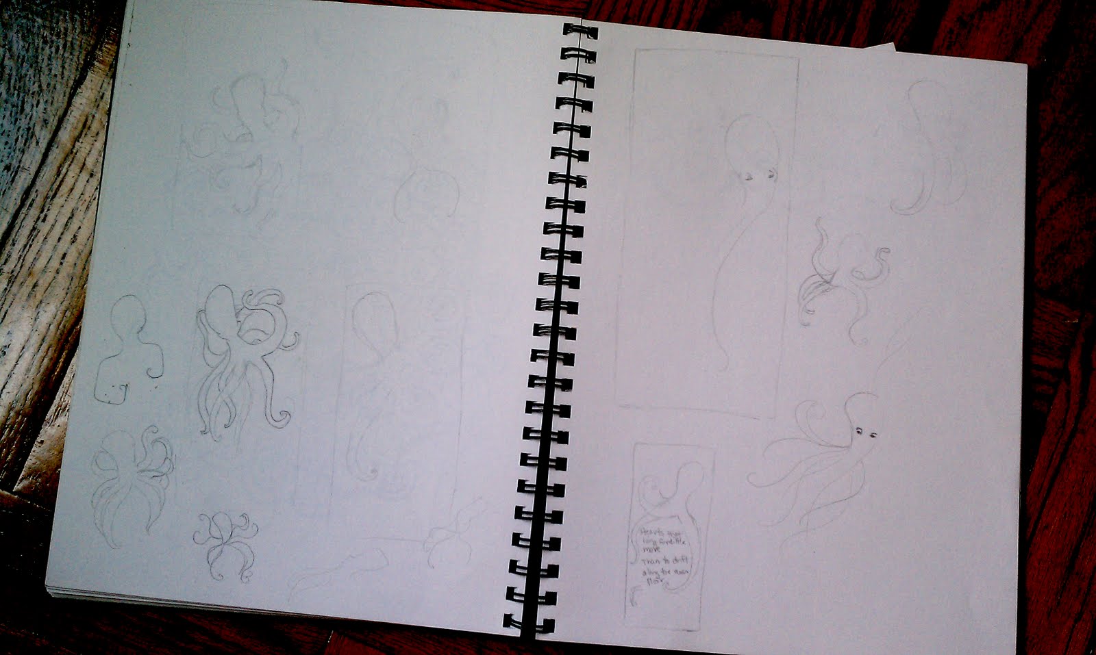
Here are some of my sketches for the woodblock print that I've been working on (slowly) for probably the last 2 months.  I've probably done about a dozen or so, thumbnails and actual size, but wasn't totally happy with any of the results. (Click to enlarge)
Little doodles

Actual size.  I like the composition but there's no room for the type.
Then after about an hour of complaining to my very patient boyfriend last night, it dawned on me that maybe I needed a different approach.  What was the best way to do that?  Turn the canvas from portrait to landscape.  I had my mind set on creating this long and narrow vertical print, but when I bought the wood, it was much narrower than I had intended.  The type would have fallen into too many short lines.  Since I was also dead set on doing this octopus and I kept coming back to the idea of drifting, a long horizontal canvas worked better to convey that idea of being swept a long.
The thumbnail
Next step is to do an actual size sketch.  I may make some adjustments so the octopus looks more like he's floating than crawling, or switch the octopus and type.  I hope to post the final sketch in the next few days!