You can also check out some behind the scenes photos on Weiland's website and make guesses about how much time it actually took to make this (answer: loads). Plenty of other cool paper stuff there as well!

Showing posts with label woodblock. Show all posts
Showing posts with label woodblock. Show all posts
Thursday, July 25, 2013
Starbucks Coffee Perfection features cut paper and block printing
This artful new video spot for Starbucks Coffee is making its way around the interwebs and I'm happy to share it since it features a few of my favorite things! Animator Rogier Weiland used cut paper to create this stop motion film showing where the coffee comes from. It also appears from the behind the scenes photos to use block printing with laser cut laminate wood and coffee as ink. Hooray for authenticity!
You can also check out some behind the scenes photos on Weiland's website and make guesses about how much time it actually took to make this (answer: loads). Plenty of other cool paper stuff there as well!
You can also check out some behind the scenes photos on Weiland's website and make guesses about how much time it actually took to make this (answer: loads). Plenty of other cool paper stuff there as well!

Monday, July 8, 2013
Now announcing the Etsy Shop: Lightheart Paper Company
Finally, I'm proud to announce the launch of my Etsy shop, Lightheart Paper Company!
To start, I'm selling some familiar prints as well as some newbies, and slowly expanding to home items. Here are a few of pics of what is available.
And this one, honoring my great home state post Hurricane Sandy, or Superstorm Sandy according to insurance companies. All profits still going to the Red Cross!
 |
| Here it is |
To start, I'm selling some familiar prints as well as some newbies, and slowly expanding to home items. Here are a few of pics of what is available.
 |
| Grow wild print |
 |
| Life of Love woodblock print |
Remember this guy?
 |
| Roaming octopus woodblock print |
And this one, honoring my great home state post Hurricane Sandy, or Superstorm Sandy according to insurance companies. All profits still going to the Red Cross!
 |
| Still Strong NJ print |
As usual, I'll be writing plenty of posts showing the creative process for my pieces and giving away all kinds of trade secrets (if I can think of any). So check it out here and send me any feedback!
Monday, April 29, 2013
Busy springtime
With the collision of weddings, birthdays, and deadlines, it's been nonstop action this April. My conversations all begin with my asking, "When is it going to get warm?" to which my boyfriend sincerely responds, "I think this week it's supposed to be nice." And after one nice day, it goes back to 50 degrees. But now that the storm has passed, I'm looking forward to a few creative weeks before a road trip vacation to the wild, wild west (this one, not this one). The biggest news: the soon-to-launch etsy shop where I'll be selling my prints! And now that I've written it here, I'm committed to it. Here's a preview of the newest woodblock.
I'll be sure to make an announcement when it goes live!
 |
| Here you are, a message of love. |
I'll be sure to make an announcement when it goes live!
Monday, February 18, 2013
Celebrating 2 years with a throwback print
Taken by the Hand turned 2 yesterday and to celebrate I ran a few woodblock prints of an old favorite. This was the first block print I'd done since a long post-college hiatus from printing after being inspired by an old piece of poplar I'd found in my parent's basement. The design was one I'd done in Illustrator, something that started out as a doodle but just kept going. It was the melding of digital and hand-made that I'd been seeking. But alas, my first few print runs were lacking pizazz, a problem quickly solved by jumping on the ombre trend. The original print blends pink and blue ink for a vibrant gradient. This guy holds a special place in my heart, and a specialer place on my wall and the walls of a few friends.
So for the refresh I added a third color and instead used yellow, pink and orange.
I'm planning on doing a few more color combos when I get some more paper, and putting them up on Etsy along with the new woodblock that I'm working on. Lots of projects have been done over the last two years and this one got me out of a slump and kickstarted them all!
 |
| The words came first and inspired the twisting and curling lines, alluding to graphic vines and roots |
So for the refresh I added a third color and instead used yellow, pink and orange.
 |
| A little like a sunset |
Oddly, these colors remind me of 90s era Oakley sunglasses, and you can judge for yourself whether that's a good or bad thing. Number two color combo was turquoise-to-blue printed on a sheet of wood paper that'd been sitting in my stash for way too long. I'd have loved to do the brighter colors on this but didn't think it would show up on the light wood.
 |
| Woodblock printed on wood: a world turned upside down |
Here's a few more shots.
 |
| Group shot! |
 |
| The block and tools. Pink! |
I'm planning on doing a few more color combos when I get some more paper, and putting them up on Etsy along with the new woodblock that I'm working on. Lots of projects have been done over the last two years and this one got me out of a slump and kickstarted them all!
Sunday, November 11, 2012
Art for Hurricane Relief
As many people know, the East Coast was hard hit by Hurricane Sandy two weeks ago. Here in Jersey City, we lost power for days, some for weeks, and had severe flooding, down trees, live wires, and other scary things. It was the worst storm the area has seen in centuries and has certainly made me more empathetic to disaster victims. Personally, I didn't get it nearly as bad as some others, which I'm grateful for, but there are lots of people whose lost homes, cars, and even loved ones. Houses floated away—that's insane!
To raise money for hurricane relief, I'm selling these prints out of my studio shop.


To raise money for hurricane relief, I'm selling these prints out of my studio shop.

All proceeds will go to the Red Cross of Northern New Jersey. The 8" x 10" piece was created from linoleum block and hand printed, so each is unique. For only $20, it's a great way to show your support, make a donation, and get a little something to take away.
You can order with PayPal using the email address stillstrongnj@gmail.com. Or visit Studio Heart to Hand for one click ordering.
Thanks for all your support as we continue to rebuild!!
Here's a few more pics of the details.


Friday, September 9, 2011
A summary of woodcut printing
Below are the simplified steps to how the Octopus woodcut print was created. Now you can view it in one place instead of navigating through a dozen different posts. By the way, after several proofs and buying lots of supplies, I finally got the hang of printing this piece. I will still be posting a final, well photographed print as soon as I can transport the good paper home without it becoming rain soaked.
Just to note, I've shifted to the term "woodcut" as opposed to "woodblock" because the former uses wood cut along the grain, and that is what I'm doing. Nowadays the terms seem to be pretty interchangeable, but it's better to just be correct, right?
In summary, here is woodcut printing:
Whoop, there it is, the basics of woodcut printing.
Just to note, I've shifted to the term "woodcut" as opposed to "woodblock" because the former uses wood cut along the grain, and that is what I'm doing. Nowadays the terms seem to be pretty interchangeable, but it's better to just be correct, right?
In summary, here is woodcut printing:
- Step 1: Get some wood. And yes, I do mean that as a double entendre.
- Step 2: Create your design. Even if it takes some practice.
- Optional: Prepare the image to be transferred, part 1 and part 2.
- Step 3: Separate the colors, one for each block, if printing 2 or more colors.
- Step 4: Transfer the design onto the wood.
- Step 5: Cut, cut, cut, and cut again.
- Step 6: Repeat steps 4 & 5 if you are using a second block.
- Step 7: Oil the wood.
- Step 8: Run prints.
Whoop, there it is, the basics of woodcut printing.
Tuesday, August 23, 2011
Inking and printing
It's been a while since carving was complete and you're probably wondering where the prints are. Sorry for anticlimax, but I was really dragging my feet when it came to buying paper. Maybe I just wasn't ready to part with the project. Nonetheless, here is the final step: inking and printing.

Roll the inked up brayer onto the block until it has an even layer of ink. The block may still suck up some ink the first time so make sure it's completely coated. It might take a couple tries.

It took a couple bad tries before this one came out. At first I wasn't using enough ink, you really need to be generous with it. The fact that it doesn't perfectly line up actually gives it a letterpress sort of feel. I'm still going to work to get the ink to cover a little better because it's a bit splotchy, and I'll post the results when I get one I like. Until the, here are some closeups showing the details.
Tools:

- Brayer — This is what rolls the ink on. I'm using a Speedball 6" soft rubber brayer. The size of the brayer should be proportional to the size of the block (I could actually use a bigger one), and make sure it's rubber, not foam.
- Inks — I like to use water based inks because they are easier to clean, but oil based inks work well too and don't dry as quickly. I chose a dark blue for the water, and a light blue for the octopus.
- Something to roll the ink on — These things include marble or granite, glass, or plexiglass. I actually use the back of my cookie sheets. It just needs to be something with a smooth, flat, non-porous surface.
- Baren — This is used to rub the paper and help transfer the ink. It's a great tool to have, but the back of a wooden spoon is a good stand-in.
- Paper — Most papers will work for this type of printing so feel free to experiment. I prefer to use something thick but a little soft, but I'm using cheaper paper until I get the print just the way I want it.
Squirt some ink on the flat surface and the brayer over top, giving it a thick, even coat. Don't glob it on, but don't be stingy either.
 |
| Roll it out |
Roll the inked up brayer onto the block until it has an even layer of ink. The block may still suck up some ink the first time so make sure it's completely coated. It might take a couple tries.

 |
| I'll go in later and cut out some more off the areas where I don't want the ink going |
Lay the paper on top of the block, leaving enough room for a border. Rub the baren in small circles with gentle pressure over entire surface. If you skip this step the ink won't transfer, or do it half hearted the print will come out blotchy.
 |
| Try to keep from saying "wax on, wax off." |
Pull the paper up and let the ink dry completely. Repeat with the second block on the same sheet of paper.
There are techniques to lining the blocks up correctly, but I don't always do things the proper way. My technique simply involves trying to line up the corners and then eyeballing it. Here's the final print!
 |
| Yay! |
It took a couple bad tries before this one came out. At first I wasn't using enough ink, you really need to be generous with it. The fact that it doesn't perfectly line up actually gives it a letterpress sort of feel. I'm still going to work to get the ink to cover a little better because it's a bit splotchy, and I'll post the results when I get one I like. Until the, here are some closeups showing the details.
 |
| Very pleased with the lettering. |
 |
| There he is. |
Wednesday, August 10, 2011
Block 2 completed plus oiling the block
It feels great to finally be done with carving. Here's an image of the final second block:
 |
| Good thing, my hands were getting pretty crippled. |
After this, I am certainly due for a new set of tools, as mine were pretty old, cheap, and now are incredibly chipped.
So now it's ready to print, right? Not quite. There's one important step that I'd actually forgotten about on previous projects: oiling the block.
Oiling the block is very simple and will save you lots of ink. Unfinished wood is dry, and being porous by nature, will suck up liquid like a sponge. You'd have to roll on several layers of ink before you could even run a print, which will probably turn out ugly and splotchy. Oiling is akin to painting with primer but it retains the texture of the wood and color of the ink.
All you need is some mineral oil and an old, but not totally filthy, rag (so not your wedding dress). It is important that you use mineral oil as other types of household oils are odorous and will turn rancid. Mineral oil is also used as a natural laxative, so it can usually be found in any drug store.
 |
| Take a spoonful if you're in the mood for a colonic |
Put some oil on the rag and rub it over the board, especially the areas where ink will be applied.
 |
| Notice the slight color change |
The wood will suck up the oil quickly at first, so several layers will probably have to be applied. The color will darken a bit, as it would if you applied stain, and this won't effect your ink. Stop once the wood stops absorbing oil.
I've got to go back and oil my first block, but after that I'll be ready for printing!
Tuesday, August 9, 2011
Block 2: Day ??
I'm back from an amazing trip abroad and have managed to squeeze a little carving in between catching up on sleep. I've completely lost track of how many days I've been working on this piece, but I'd say I might actually finish the second block tonight!
 |
| Word that best describes this project: painstaking |
Wednesday, July 6, 2011
Block 2: day 4
A few days ago, I started on the second block for my octopus print. You may remember it from this post on color separation. I was a little overzealous on the long weekend, and actually needed to give my hands a day off afterwards. The lettering is coming out very well—much better than I was anticipating. Since the areas are so small, it's all been cut out with Xacto blades, and I'm running through them like it's nobody's business. Once the last few words are cut out, the octopus will feel like child's play.
 |
| I fear I may be developing a wicked case of carpal tunnel. |
Monday, June 27, 2011
Block 1: Final day
All done! After a long week of work kept me away from this project, I was finally able to cut away the large areas. Just some minor clean up and then it's on to block 2.
 |
| The creature emerges |
Monday, June 13, 2011
Block 1: Day 17
All the edges are cleared! Tomorrow I'll gouge out the large areas and be finished with the first block.
 |
| I actually thought this would take a lot longer. |
Wednesday, June 1, 2011
Block 1: Day 5
 |
| Head and 2 arms cleared |
Bonus!
All the flowers in town seemed to have bloomed overnight. Here's a snapshot of some urban gardening in action. These are pink clematis.
 |
| This could be one of the wallpapers that comes with your phone |
Thursday, May 26, 2011
Transferring
The final image has been mirrored, printed, and is ready for transfer. It was too large for one 11"x17" page, so I had to tape two pages together.
This is a down and dirty, old-fashioned image transfer. You've probably done something like this in 3rd grade art class. So here we go...
Step 1: Using a graphite stick (or a pencil if you've got a lot of time), and color over the entire back side of the image.

There's no need to go much beyond where your image is, just make sure to get a full, solid cover of graphite as below.
Step 2: Flip the print out over and align to the edge of the wood block. Use tape to hold it in place. When printing with two blocks, it is very important to make sure the images are transferred into the same position on each separate block, so give yourself some crop marks or a hairline along the outside so you can line it up easily (mine has a very light box in the background).
Step 3: Take a pen or pencil and trace around the outline of the drawing.
The lines will transfer onto the woodblock as below. It's helpful to keep checking to make sure all the lines are being traced. Just lightly draw over it, right onto the wood.
 |
| I remembered to flip it the second time. |
Step 1: Using a graphite stick (or a pencil if you've got a lot of time), and color over the entire back side of the image.

There's no need to go much beyond where your image is, just make sure to get a full, solid cover of graphite as below.
 |
| It was a nice day, so I did this on my fire escape. |
Step 3: Take a pen or pencil and trace around the outline of the drawing.
 |
| You don't even need to press super hard |
The lines will transfer onto the woodblock as below. It's helpful to keep checking to make sure all the lines are being traced. Just lightly draw over it, right onto the wood.
 |
| A little peek |
Keep going until the whole thing is traced onto the block. Next up is carving! I'll be posting pics as I go.
Thursday, May 19, 2011
Separating the colors
Here is the final octopus print broken down into the two different color blocks. The white part is what will be carved away, leaving the colored part to take the ink and make the relief print. Everything will be cut out except that single color and there will be no overprinting, meaning that the blocks must align perfectly when cut and printed.
Here's block 1—the octopus:


If you're wondering about the copy line, I came up with this after reading that octopus have 3 hearts and camouflage themselves from predators on a children's website. Because it doesn't seem that too many adults are searching "octopus facts." The exact wording came together after several failed attempts to come up with a sea shanty-esque rhyme.
Next step: Print out and transfer to the wood
Here's block 1—the octopus:

Here's block 2—the text and embellishments:

Printed together, they will look like this:
 |
| You can ignore the xy values, those aren't going to be printed |
Of course they'll look much cooler than this because it will be real ink, with all the flecks and smudges and imperfections that make prints so unique and awesome. In the end, I decided it would be easier to cut out the small letters and graphics instead of carving around them, so the text and suction cups will remain white, or paper colored. Remember that these still must be mirrored before they can be transferred onto the wood, which I'll do just before I print them.
If you're wondering about the copy line, I came up with this after reading that octopus have 3 hearts and camouflage themselves from predators on a children's website. Because it doesn't seem that too many adults are searching "octopus facts." The exact wording came together after several failed attempts to come up with a sea shanty-esque rhyme.
Next step: Print out and transfer to the wood
Wednesday, May 18, 2011
Digitalizing the design part 2
Here's the octopus in a more finished form. For a more organic feel, I varied the thickness of the lines where where the body overlaps. A few more suction cups (that's a scientific term) on the arms to add more color throughout. Unfortunately, I fear I may have a lot of difficult work ahead of me, carving out very small lines.

Up next: Separating the colors, one for each block.
Wednesday, May 4, 2011
The final octopus
As promised, here is the latest sketch, full size.
Even as I write this post and stare at the photo, I keep jumping off the computer to make little changes in lines, so the end result may look slightly different. This project is finally shaping up! The next step is scan it into the computer, trace over the lines in Adobe Illustrator, and add the type, which I'll go into detail about in the next post.
 |
| Maybe he needs a name |
 |
| A close up |
Tuesday, May 3, 2011
Getting sketchy
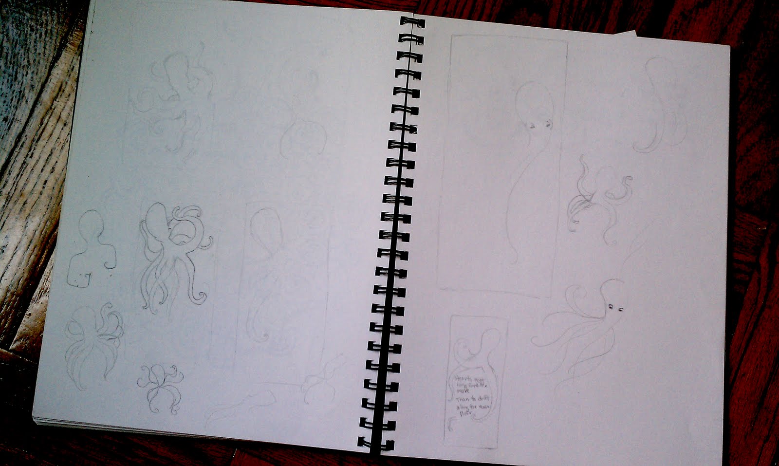
Here are some of my sketches for the woodblock print that I've been working on (slowly) for probably the last 2 months. I've probably done about a dozen or so, thumbnails and actual size, but wasn't totally happy with any of the results. (Click to enlarge)
Then after about an hour of complaining to my very patient boyfriend last night, it dawned on me that maybe I needed a different approach. What was the best way to do that? Turn the canvas from portrait to landscape. I had my mind set on creating this long and narrow vertical print, but when I bought the wood, it was much narrower than I had intended. The type would have fallen into too many short lines. Since I was also dead set on doing this octopus and I kept coming back to the idea of drifting, a long horizontal canvas worked better to convey that idea of being swept a long.
Next step is to do an actual size sketch. I may make some adjustments so the octopus looks more like he's floating than crawling, or switch the octopus and type. I hope to post the final sketch in the next few days!
 |
| Little doodles |
 |
| Actual size. I like the composition but there's no room for the type. |
 |
| The thumbnail |
Monday, March 14, 2011
Time to get busy
 |
| The twins |
Subscribe to:
Posts (Atom)