Showing posts with label paper. Show all posts

Thursday, August 1, 2013

Tree and moon etching #tbt

As the instagramers and tweeters say, it's Throwback Thursday!  Although I'm sure you'd prefer to see a picture of me in the tub as a fat baby, you'll have to settle for this class project from the college years. 2005 to be exact.

I was really into trees, at the time

This was a plexiglass etching, sketched freehand directly onto the plexiglass.  The paper is wet and then run through a printing press with the wall paper (moon) and tissue paper (blue leaves), where the pressure fuses the two papers together.  Oh the glory days of having unlimited access to gigantic studios and commercial grade machinery!

Thursday, July 25, 2013

Starbucks Coffee Perfection features cut paper and block printing

This artful new video spot for Starbucks Coffee is making its way around the interwebs and I'm happy to share it since it features a few of my favorite things! Animator Rogier Weiland used cut paper to create this stop motion film showing where the coffee comes from. It also appears from the behind the scenes photos to use block printing with laser cut laminate wood and coffee as ink.  Hooray for authenticity!


You can also check out some behind the scenes photos on Weiland's website and make guesses about how much time it actually took to make this (answer: loads).  Plenty of other cool paper stuff there as well!

Friday, July 12, 2013

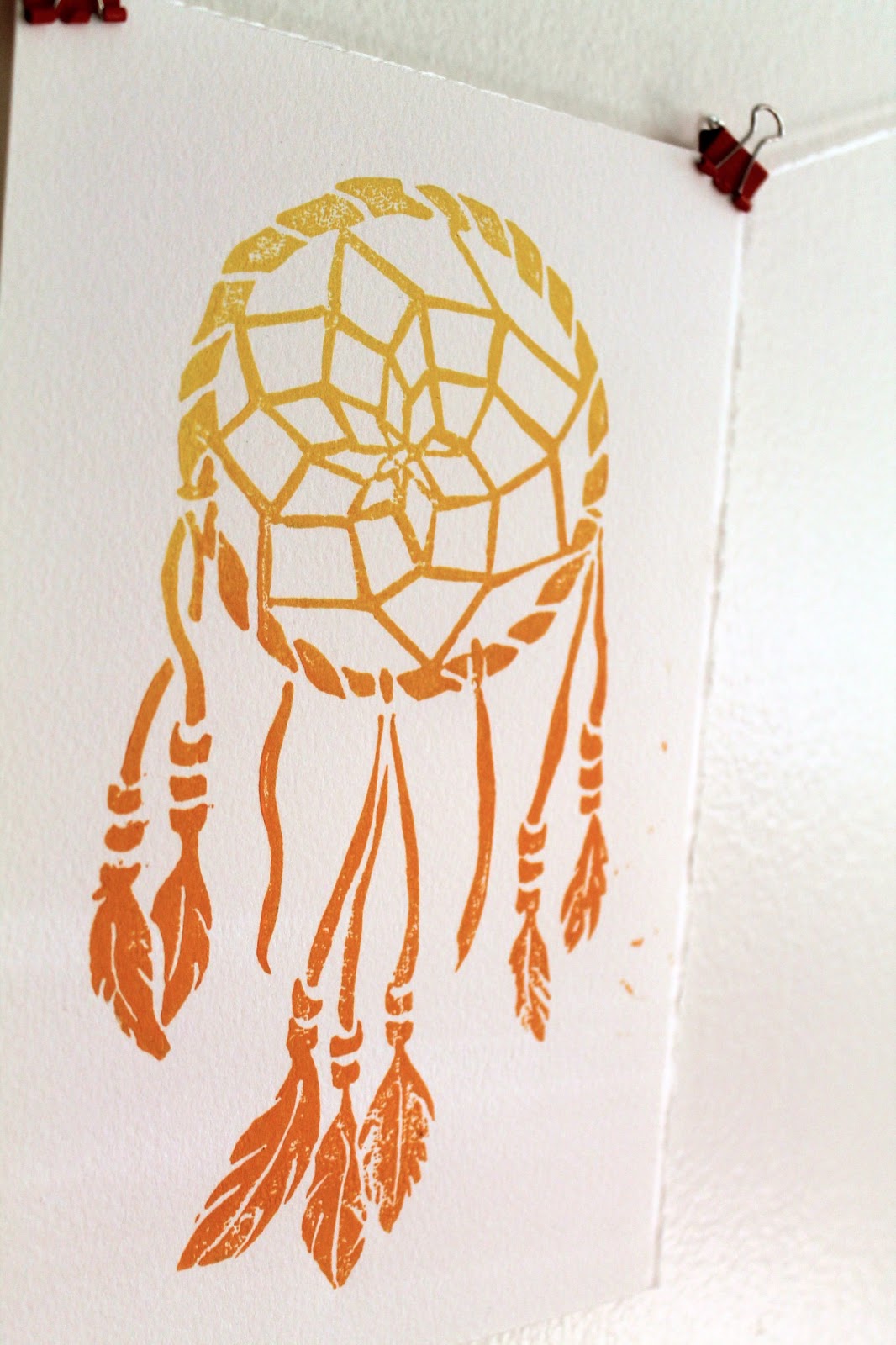
Colorful Dreamcatcher Art

After my recent trip to the Utah and Arizona, I was feeling the inspired by the brilliant colors and native spirit of the southwest. I got a little caught up in the vacation mindset and bought a dreamcatcher from a little mountain shop.  I built one from a kit when I was just a little guy (one of the many craft kits that actually resulted in a finished project), so when I got home, I decided to make an adult version (in a totally SFW way). The result is these linocut prints in yellow/orange and gold.

Very Boho

Gold, or dorado

Both colors are available to purchase in the Etsy shop, Lightheart Paper Company, orange and gold.

Unlike a lot of my other prints, this one I drew entirely by hand, no Adobe Illustrator involved.  Here's the sketch, which started in pencil and ended in sharpie.


Originally I had intended to add some text at the top saying "Sweet Dreams," which you can see ghosts of in the sketch, but in the end it seemed better to leave it off.  I may add it as separate stamp in the future, that way it can be printed with or without the text.

I'm going to hang one or two of these above my bed with the real one in hope that I can stop having the dream where I am in school but don't know where I'm supposed to go!

Thursday, June 20, 2013

Illustrated Cityscapes: Chicago


The Chicago skyline stands tall in this black and white illustration, commissioned for a save the date. I've never been to there, but it's on the "to visit" list right below Boston, only because Boston is  driving distance from me.  Done in the usual fashion: India ink on watercolor paper.


I like the skylines the best when they include boats.


Wednesday, May 1, 2013

Watercolor wishes

This watercolor illustration has been a long time in the making. I hesitated on it for a while because I couldn't find the right words and wanted to use my own instead of a quote. It was, however, inspired by a meditation/prayer which I learned on my spiritual journey, but was unable to trace the origin of, "May you be happy, may you be healthy, may you live with ease."  You're supposed to say it to yourself when someone has pissed you off or has caused some deep therapy-necessitating emotional damage.  This one is more suited for a new home or marriage.

It's like, my version of an Irish wedding blessing

While technically I "hand drew" the letters, I did pretty much copy actual fonts while adding embellishments.

Cheater, cheater, pumpkin eater. Wait those aren't the words.

The colors aren't playing nice together and I don't like what's going on with the wind illustrations here. So those are changes that I'll be addressing in the next round.

You can even still see pencil marks--someone's lazy!

I do like the sunshine!

So there's the beta version, a happy wish for friends and enemies alike.

Monday, April 29, 2013

Busy springtime

With the collision of weddings, birthdays, and deadlines, it's been nonstop action this April.  My  conversations all begin with my asking, "When is it going to get warm?" to which my boyfriend sincerely responds, "I think this week it's supposed to be nice." And after one nice day, it goes back to 50 degrees.  But now that the storm has passed, I'm looking forward to a few creative weeks before a road trip vacation to the wild, wild west (this one, not this one).  The biggest news: the soon-to-launch etsy shop where I'll be selling my prints!  And now that I've written it here, I'm committed to it.  Here's a preview of the newest woodblock.

Here you are, a message of love. 

I'll be sure to make an announcement when it goes live!

Tuesday, March 26, 2013

Modern wedding invitations for Fall

Even though Spring is just beginning and autumn seems miles away, I'm posting this follow up to my previous entry for Autumn save the dates with the actual invitations.


As I mentioned in the first post, one of my favorite things about these is that even though they use a fall color palette, the graphic pattern and bold type are so unexpected. This set also really shines when it comes together as a suite that includes an invite, rsvp, envelope liners, and reception card all held together with a monogrammed band. The band is made of maroon ribbon and adhered to itself and the paper monogram with glue dots, the greatest thing ever.

A monogrammed band: wrap it up

The bride gets a lot of credit for these; she knew just what she wanted.  Elements of the pattern from the save the date are used throughout, and a berry purple was substituted for the golden yellow to better match the flowers.  Here are a few closeups!

The invitation

The reception card

The color palette and pattern could easily be changed to match any season or theme desired by a modern, anti-flower couple!

Wednesday, March 20, 2013

Bridge illustration no. 2

Not too long ago I posted an illustration of the Manayunk Bridge, and I'm here to post another illustrated river crossing in Philadelphia.  I'll be spending a few weekends there this spring, and I look forward to exploring this city that I'm coming to like more and more with each visit.  Maybe I have a soft spot for old Ben, being an F&M alum, or maybe it's the fact that the mortgage payment on a 3-br house is as much as the rent for my studio apartment.

Anyway, I'm not actually sure what the name of this bridge is so if anyone does, please post in the comments. 


And as always a close up.

You can tell the lights are on from the light bursts.

Happy first day of Spring!  Although the forecast tomorrow calls for snow.  We might as well be living in Canada!

Friday, March 15, 2013

Monday, March 11, 2013

Quick Personalized Stationary

As you can probably tell from my frequent post about cards, I love sending mail. When a boxed card just won't do, and you are short on envelopes, it's easy to whip up a quick, personalized bit of stationary using stamps, cover stock, and some fun paper. 

Leave a pretty note on the car you hit and the owner can't be mad.

To create a unique envelope, simply deconstruct another envelope (make use of that junk mail), trace the shape onto scrapbook paper or some other lightweight paper, cut and reassemble.  Cut your cover stock to fit inside and adorn with your personal monogram or anything else you can come up with.  Don't limit yourself to stamps either!  Now you can write your correspondences like they are always doing on Downton Abbey when they aren't killing off main characters.

A heartfelt apology.

Now you have a very personal note ready in 10 minutes or less!  I'm sensing a "quick and easy" theme starting to emerge for March.


Monday, March 4, 2013

20 minute paper "button" garland

With a spare gap of time before dinner, and an itch to do something crafty, I made up this quick paper garland with in just a few easy steps.  All you need is the right tools and 20 minutes--it's easy as pie!

Spice up your generic lamps

Thursday, February 14, 2013

Happy Valentine's Day!

Happy V-day! 8-bit style love to my readers!

Conversation heart puffy stickers by Hallmark courtesy of Dad.

Saturday, January 19, 2013

A wedding at the zoo!

You can imagine how excited I was to be working with Rachel and Clay when they told me their wedding next year would be held at the Bronx Zoo!  What a unique and nontraditional venue that allowed for some really creative stuff.  After speaking with the bride, we'd have to find the right balance between zoo theme and classy wedding, so it doesn't look like a child's birthday party.  To keep it elegant, I went with simple animal silhouettes in black on bright white linen paper.  As a personal touch, one of the silhouettes is actually the couples' rambunctious mutt, Hannah!

I took several stabs at this, and here's one of the alternates, more modern and casual with different kinds of type mingling.
All the animals at the zoo get along swimmingly


The final invitations just printed and I'll post them shortly, along with the official save the date.

Sunday, November 18, 2012

Rustic Fall Invitations

A few months back, I did this watercolor email save the date for Joel and Jazmine, my most country friends.  This organic handmade style carried through to their invitations, but with colors shifting from spring to fall.  Their wedding came just on the cusp of superstorm Sandy, and was the last beautiful weekend in the area, with leaves bursting with every color.  Their invitation fit right in!


Monday, August 27, 2012

A classic invitation set

This traditional and elegant wedding invitation suite was created for Lydia and Rodrigo, a sweet and social couple living in Washington DC. 


For who don't know, DC is prep-city, but a pretty awesome place to hang out nonetheless.  Lydia and Rodrigo both grew up in the area and with their wedding at a country club just outside the city, this style fit perfectly with the scene. 

Tuesday, July 3, 2012

As seen in real life: Graphic marriage certificate

At a recent wedding, the bride and groom had this beautifully illustrated marriage certificate at the end of the isle for all the guests to sign after the recessional. The vines and green shades were a perfect match for their casual, garden ceremony in downtown Philadelphia.  Of course I love the charming typography!


Wednesday, June 27, 2012

Paper in window displays


Paper, being cheap, disposable, and easy to ship, is a popular choice for store window display. I recently came across two beautiful, and very different examples, of cut paper working it behind the glass.

This was spotted outside Made with Love, the little cafe/bakery where I take my friends when trying to prove that I live in a nice neighborhood:

This was about 18" x 24" and looked hand cut

This second, dimensional piece (flowers I suppose) adorned the windows of one of my favorite stomping grounds, Paper Presentation. Sorry the photo is so close up, there was scaffolding I was trying to avoid.

Probably not hand cut
I'll be keeping my eye out for more pretty papers!