Showing posts with label color. Show all posts

Friday, July 12, 2013

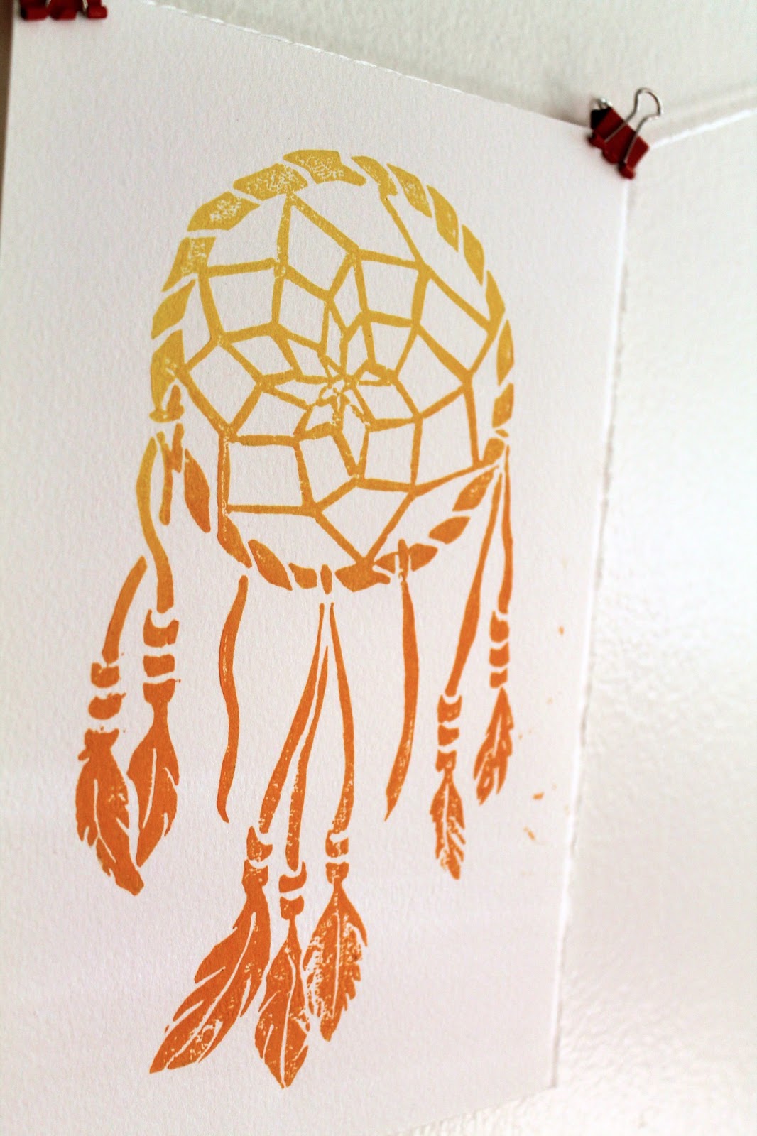
Colorful Dreamcatcher Art

After my recent trip to the Utah and Arizona, I was feeling the inspired by the brilliant colors and native spirit of the southwest. I got a little caught up in the vacation mindset and bought a dreamcatcher from a little mountain shop.  I built one from a kit when I was just a little guy (one of the many craft kits that actually resulted in a finished project), so when I got home, I decided to make an adult version (in a totally SFW way). The result is these linocut prints in yellow/orange and gold.

Very Boho

Gold, or dorado

Both colors are available to purchase in the Etsy shop, Lightheart Paper Company, orange and gold.

Unlike a lot of my other prints, this one I drew entirely by hand, no Adobe Illustrator involved.  Here's the sketch, which started in pencil and ended in sharpie.


Originally I had intended to add some text at the top saying "Sweet Dreams," which you can see ghosts of in the sketch, but in the end it seemed better to leave it off.  I may add it as separate stamp in the future, that way it can be printed with or without the text.

I'm going to hang one or two of these above my bed with the real one in hope that I can stop having the dream where I am in school but don't know where I'm supposed to go!

Friday, July 5, 2013

Southwestern Color Palettes

My first trip to the Southwest was a visceral experience.  14 days away from city noise, humidity, rain, and the monotony of every day. But it wasn't just the escape, it was being embraced by nature, seeing bright reds and yellows in the stone, vast open spaces, and the crystal clear moons. We started in western Colorado, then Utah, stopping at Arches NP, Canyonlands, Bryce Canyon, and Zion, then finishing up on the North Rim of the Grand Canyon.

Now, this may just be an excuse for me to post my vacation pictures and talk about my vacation, but the sights are truly inspirational.  So along with each photo I'm adding a corresponding color palette for dressing, drawing, decorating, and other things that may or may not start with d.

This first palette is from Hanging Lake, which lies on a mountain top near Glenwood Springs, CO, and requires a 2 mile hike to get to.  This hike is harder if you're carrying your friend's child on your back.  The unique minerals color the water this crazy turquoise color!

Hanging Lake, no swimming allowed

Here's a little desert flower, shot near Moab Utah. The oranges begin here.

Lots of awesome colorful flowers on the side of the road.

Next is Canyonlands, also in Utah. Place is "cray," looks like another planet.  We did an amazing overnight hike into the canyon here.  


Below is Bryce Canyon, my favorite spot.  We regrettably only spent one night here.  The rock formations are called "hodos," and as you can see, the sunlight turns them neon.

Sunrise


Lastly we come to the Grand Canyon. It IS as cool as everyone says.


I could post a million pictures, well 900 to be more accurate.  But I'll stop here.  Just a little taste of all the colors the earth has to offer!


Tuesday, June 25, 2013

Chalk lettering illustrations on "I Call Shotgun"!

A few weeks ago I was given an incredible opportunity to create some chalk board illustrations for the set of AOL's webcast I Call Shotgun. This video segment features Bravo's Andy Cohen interviewing Jerry Seinfeld as he wraps up the second season of his web show Comedians in Cars getting Coffee. Here's a clip from youtube, you can see a nice closeup of the set illustration at 0:07.


The full show can be seen here.

In lieu of the cars and coffee theme, the set was designed as a retro, right-off-the-highway diner, and some typographic chalkboard menus fit right in.

Retro chic, right down to the cronuts

Time was tight, with one night spent sketching up ideas, and the next night to executing them on a set that was only half built after working an 8 hour day.  But the set designer, who happens to be my very talented brother, must have know that I couldn't say know to hand drawn art, especially when typography and Seinfeld are involved.  The panels totaled 6 in all, and I kept with one food theme for each that could be the point of emphasis.  Here are some pics from the set as well as all 6 after the jump.

Left side panels

Right side panels

Sunday, June 16, 2013

Wednesday, May 1, 2013

Watercolor wishes

This watercolor illustration has been a long time in the making. I hesitated on it for a while because I couldn't find the right words and wanted to use my own instead of a quote. It was, however, inspired by a meditation/prayer which I learned on my spiritual journey, but was unable to trace the origin of, "May you be happy, may you be healthy, may you live with ease."  You're supposed to say it to yourself when someone has pissed you off or has caused some deep therapy-necessitating emotional damage.  This one is more suited for a new home or marriage.

It's like, my version of an Irish wedding blessing

While technically I "hand drew" the letters, I did pretty much copy actual fonts while adding embellishments.

Cheater, cheater, pumpkin eater. Wait those aren't the words.

The colors aren't playing nice together and I don't like what's going on with the wind illustrations here. So those are changes that I'll be addressing in the next round.

You can even still see pencil marks--someone's lazy!

I do like the sunshine!

So there's the beta version, a happy wish for friends and enemies alike.

Tuesday, March 26, 2013

Modern wedding invitations for Fall

Even though Spring is just beginning and autumn seems miles away, I'm posting this follow up to my previous entry for Autumn save the dates with the actual invitations.


As I mentioned in the first post, one of my favorite things about these is that even though they use a fall color palette, the graphic pattern and bold type are so unexpected. This set also really shines when it comes together as a suite that includes an invite, rsvp, envelope liners, and reception card all held together with a monogrammed band. The band is made of maroon ribbon and adhered to itself and the paper monogram with glue dots, the greatest thing ever.

A monogrammed band: wrap it up

The bride gets a lot of credit for these; she knew just what she wanted.  Elements of the pattern from the save the date are used throughout, and a berry purple was substituted for the golden yellow to better match the flowers.  Here are a few closeups!

The invitation

The reception card

The color palette and pattern could easily be changed to match any season or theme desired by a modern, anti-flower couple!

Monday, February 18, 2013

Celebrating 2 years with a throwback print

Taken by the Hand turned 2 yesterday and to celebrate I ran a few woodblock prints of an old favorite. This was the first block print I'd done since a long post-college hiatus from printing after being inspired by an old piece of poplar I'd found in my parent's basement. The design was one I'd done in Illustrator, something that started out as a doodle but just kept going. It was the melding of digital and hand-made that I'd been seeking.  But alas, my first few print runs were lacking pizazz, a problem quickly solved by jumping on the ombre trend. The original print blends pink and blue ink for a vibrant gradient. This guy holds a special place in my heart, and a specialer place on my wall and the walls of a few friends.

The words came first and inspired the twisting and curling lines,
alluding to graphic vines and roots

So for the refresh I added a third color and instead used yellow, pink and orange.

A little like a sunset

Oddly, these colors remind me of 90s era Oakley sunglasses, and you can judge for yourself whether that's a good or bad thing.  Number two color combo was turquoise-to-blue printed on a sheet of wood paper that'd been sitting in my stash for way too long.  I'd have loved to do the brighter colors on this but didn't think it would show up on the light wood.

Woodblock printed on wood: a world turned upside down

Here's a few more shots.

Group shot!


The block and tools. Pink!

I'm planning on doing a few more color combos when I get some more paper, and putting them up on Etsy along with the new woodblock that I'm working on.  Lots of projects have been done over the last two years and this one got me out of a slump and kickstarted them all!


Tuesday, January 8, 2013

Impromptu watercolors on a Tuesday night

With the craziness of the holidays, moving, and wedding invitations, I didn't get to do much freestyle creative.  On Sunday night, I promised myself to do something creative this week that was just for myself, and for no reason.  So here's a little watercolor design inspired by my coasters and a book on historical pattern design, just for fun.

Camera 1:
The apartment has great windowsills

Camera 2:
Yes, this could be a coaster

Friday, March 9, 2012

Philadelphia International Flower Show

The Philadelphia International Flower Show is totally where it's at for people who like literally anything flower related.  One part expo, one part county fair, and one part market, this event is a cocktail of color and inspiration.  Held in the enormous Philadelphia Convention Center, there seems to be an endless stretch of things to see, from 1000 square foot displays to tabletop flower arrangements.  20 year old prize winning cacti mingle with front yard gardens and botanical illustrations.  Unfortunately you're not allowed to walk into any of the displays, which takes a pretty high level of restraint. To say you're overstimulated is an understatement.    

Enough with the clever prose, it's time to get to the pictures.  I apologize upfront for the low quality; all the "mood lighting" actually makes the room fairly dark and it's incredibly crowded.  This is only a small sampling, click the link at the end to view the full album.  Feast your eyes...

A store window display in an old card catalog

A jungle scene composed entirely of pressed flowers!

Botanical illustration of an orchid puts my water colors to shame. 

I love this color palette of white, pink, and peach.
Indoor waterfall.  Probably the largest display in the show.
Magenta and orange orchids
Down the isle.
 See the rest of the photos here.

Wednesday, February 8, 2012

It must be Valentine's Day

Valentine's day is less than a week away, so there's still time left to make a homemade card or order those pajama-grams that NPR is always advertising (that wouldn't be a good present for me).  I used to be a real V-day hater, but I've come to see it as just a fun, harmless holiday that doesn't have to be taken all that seriously.  So this year I've gone the "cute" route and made a watercolor card and a glittery bookmark.

A card


A glittery bookmark

Read on for more details.

Tuesday, October 18, 2011

Fall Palettes

It's finally starting to cool down here in the Northeast and we're finally getting to experience my favorite thing about fall: the colors.  So while at a garden center this weekend (ok, it was really a pumpkin patch), I found myself lost in a sea of mums, the flower that flanks everybody's doorway.  It was a beautiful sight, and an inspiration for seasonal 2 color palettes.

The first picture, they almost look like heads of cauliflower.


The palette, warm and comforting shades.

Squashes and cranberries

This image is a little sharper and lighter.


As a result, the palette is a little cooler and brighter. 

Crisp and cheery
You can incorporate all the shades of the season into your wardrobe, decorating, and cooking!  Once November hits, things start to get depressing, so get out and enjoy all the beautiful Fall colors while you can!